
Case Study CITGO Corporate Website Redesign
CLIENT
CITGO
OUR CHALLENGE
Prologue was asked to improve communications capabilities and back-end management for the CITGO corporate website. The website had been through a recent re-design, but development was poorly executed. CITGO was left with a 3-year-old site that looked much older and was very difficult and time-consuming to update. They asked us to help them evaluate fixes to these issues and launch a better web experience for both visitors to the site and the employees charged with maintaining it.
STRATEGY & APPROACH
We worked collaboratively with the CITGO team to assess the site's strengths and weaknesses through both a brand and communications lens. We also evaluated the site from a tech and ease-of-use perspective. Prologue helped CITGO determine the right partner for the development portion of the work and ensured that the chosen CMS platform would integrate with the current CITGO IT and security specifications. We then led the client through a series of User Experience exercises and workshops, interviewing a number of stakeholders through the company as well as a representative pool of potential visitors to the site. From this initial work we built out a structure and navigation system that met the client’s needs while keeping key user needs top of mind. In the process Prologue worked with the CITGO in-house creative team to refresh application of their brand and keep the aesthetic contemporary on their new website.
SCOPE OF WORK
Product: Corporate Website Redesign
Timeframe: 12 months
Delivery:
Website Audit & Recommendations
UX Structure & Navigation System
Custom UI and Digital Brand Refresh
Partnership & Collaboration with chosen Development Partner
Tech/Tools Used:
Adobe Creative Cloud, Figma, PowerPoint, Zoom

OUTCOMES
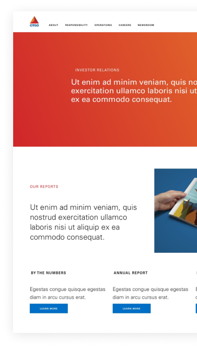
The result was a brand new CITGO.com. The new site not only improved the overall brand reputation, but also improved visitor sessions and dramatically streamlined the back-end management experience.

UX Elements
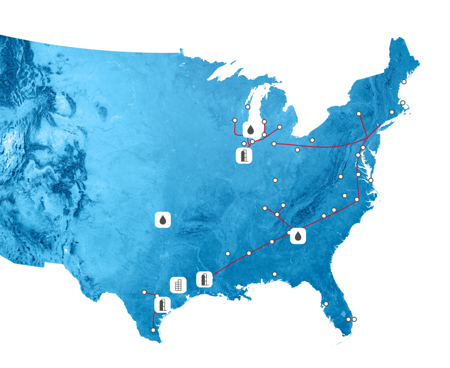
A large portion of the website work was to redesign the station locator tool. This tool was used primarily by customers searching for specific information on local stations. Since stations are independently owned, this effort required a large UX undertaking to ensure the solution not only met the expectations of the customer - but also the station owner.
Station Locator

MOBILE MENU

FIELDS & BUTTONS


ICONS


PAGE LAYOUTS


Wireframe to Visual Design

The site’s visitors were a 50/50 split on Desktop vs. Mobile. We took that into consideration when making decisions on how the site would fold down to a mobile state. We made sure that features of the site that would be critical to a user on-the-go would be simplified and more useful on mobile.


ADDITIONAL WEBPAGE LAYOUTS


TYPOGRAPHY, COLORS & ICONS


CUSTOM ICON SET


